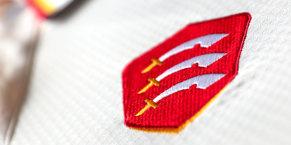
Essex Cricket has launched a refreshed identity that unites all aspects of the club’s activities. The new, more contemporary crest retains the core essence of the Club’s historic identity, adding a feature that represents an eagle in flight, bringing The Eagles into the core identity for the first time. The refresh will encompass the full Essex Cricket ecosystem, from elite performance teams to the extensive community programmes and other commercial activities united under a single brand platform.
Background:
The brand refresh programme started in October 2021 with a recognition that the Club’s brand landscape had become overly crowded and unclear through a plethora of different logos representing different parts of the Club.
Landor & Fitch, the world’s leading brand transformation company, was engaged pro-bono. Their team have been responsible for some of the world’s most iconic sports brands, including Cricket Hong Kong, the Australian Open, NY Rangers, Wembley Stadium, the NFL, the R&A and multiple Olympic games. They are currently working on the 2032 Olympic and Paralympic Games in Brisbane.
The Essex brand refresh was headed by APAC President and former Ilford and Essex Schools cricketer Jonathan Cummings along with Executive Strategy Director and Eagles fan former Woodford Wells cricketer, Ash Banerjee.

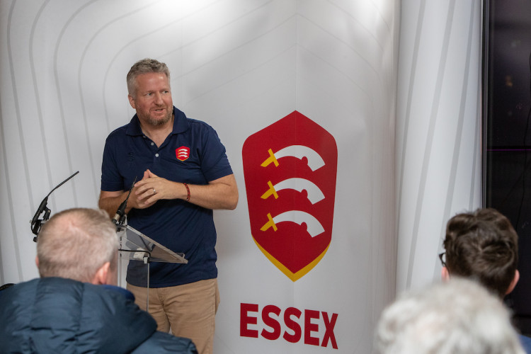
Photo: Jonathan Cummings from Landor & Fitch addressing the audience at the Members’ Brand Launch event
Process:
The Landor & Fitch team spent six months carefully getting to know the club, engaging with multiple stakeholder groups including members, players, community programme leaders and participants, staff, sponsors and former players. They also conducted a thorough audit of the Club’s activities as well as the first-class county, global cricket and global sports landscape.
A new brand platform was developed that brings together the entire club under a simplified brand strategy, that is built on the unique, distinctive, bold, and ambitious character of the Essex Cricket community.
From this platform, a refreshed identity was developed, bringing to the fore the sacred brand assets of the Club in a more contemporary and digital-first manner.
In order to keep the cost of the refresh as close to zero as possible, the new brand will be rolled out via natural replenishment cycles, with a new kit for the 2023 season, new signage at The Cloud County Ground, Chelmsford and a new website being the core applications during the summer.
The new brand will see the Eagles crest relinquished from white-ball cricket. We are not losing the Eagle completely. We are unifying all aspects of the Club under one brand, which references the Eagle in the new identity. Recognising the manner in which ‘The Eagles’ has become a connecting identity amongst the community, we have extended its reach across all parts of the club and freed it from the constraint of being only associated with white-ball cricket. Going forward, we are always ‘The Eagles’.
On-going development:
The refreshed brand platform will be further developed in terms of story-telling and core messaging across channels as well as expanded applications featuring a new Eagle icon which already features on the 2023 T20 kit.
The launch video:
The launch of new crest featured a promotional video showcasing all the different areas of the Club from the Ability team to local school children, and staff to our Members. The video was filmed across Essex, including The Cloud County Ground and the Leyton Hub and we thank everyone who was part and Blank Space Creative who filmed the video.


